Echo
AI Design Research
Digital Health
2025

Human-Centered Approach to Relational AI in the Therapeutic Process

Mymenu was a leading food delivery app in Northern Italy, known for its exclusive partnerships with carefully selected restaurants.

In a context of increasing interest from international competitors, the team’s goal was to demonstrate that the project was active and evolving, solidifying investor confidence and encouraging acquisition offers.

My role was to lead functional improvements and the aesthetic redesign of the app, aiming to reinforce the brand’s identity and enhance the user experience.

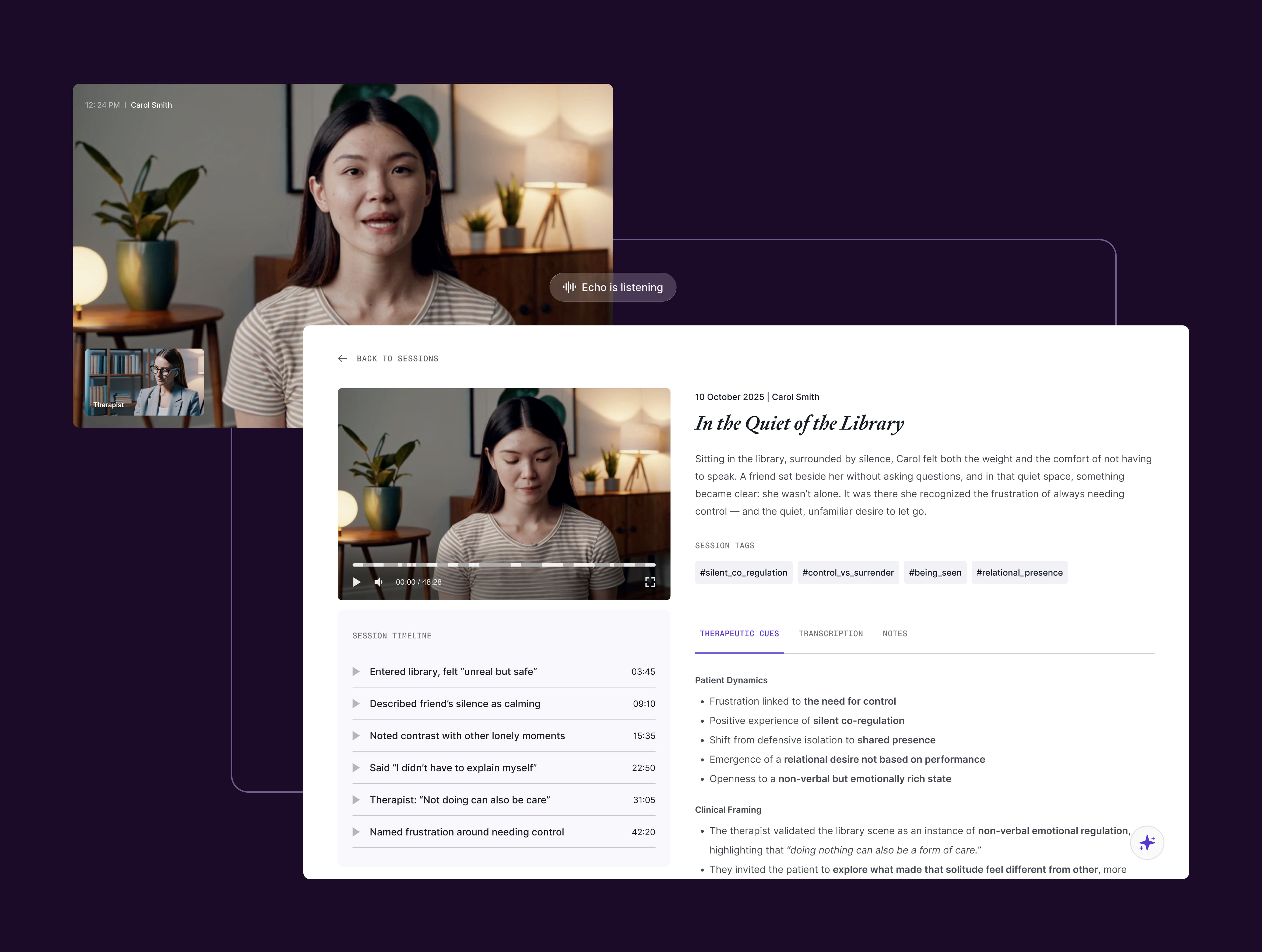
Echo is a design inquiry into the evolving role of AI in psychotherapy.

As AI systems become increasingly present in mental health contexts, a central question emerges: what functions can these tools serve without compromising the clinical frame?

This project explores how AI might operate within the therapeutic process—what it can meaningfully support, where it risks interference, and how its integration could remain consistent with ethical and relational principles.

Witor's, a historic Italian company active in chocolate production since 1959, has requested a complete remake of its online platform. The main objective was to redesign and optimize the website interface, in line with the rebranding activities concurrently undertaken by the brand.

ghd, a leading brand in hair care products, is known for its strong ties to hairdressing salons and professionals distributing ghd-branded items to consumers.

ghd Italy sought Dynamo's assistance in supporting B2B targets by boosting salon traffic to attract new clients. The challenge was to digitally stimulate physical traffic recovery post-pandemic restrictions.

Collaborating with the cross-functional Caffeina team, I identified a digital opportunity aligning ghd's end customers (B2C) and salons (B2B), resulting in "Free Your Style." This service allows customers to book a complimentary hairstyling session with local ghd professionals, streamlining the digital experience of a physical service.

Parmalat, a global leader in the dairy industry, partnered with Caffeina/Dynamo to redesign its digital ecosystem, aiming to enhance user engagement and online visibility.

The project focused on modernizing interfaces to align with contemporary design trends, reflecting the innovation and quality that define the Parmalat brand. This transformation was essential to strengthen its digital presence and provide a fresh, engaging experience for users.

Ariston Group, a global leader in thermal comfort, needed a corporate website redesign that could accurately reflect its stability, innovation, and heritage while maintaining a distinct identity separate from its individual brands.

The challenge was to create an experience that catered to investors, PR professionals, and industry experts, balancing authority, accessibility, and visual impact in a modern, long-lasting design.

75.434

Website visits
(first 3 months)

30.827

Bookings
(estimated 8.000)

40%

Conversion rate

90%

Customer satisfaction

+44%

Rating Apple Store

+67%

Downlads Apple Store

+47%

Rating Play Store

+150%

Downloads Play Store

+133%

Website visits

+34%

Page per session

+52%

Drive to ecommerce

90%

Customer satisfaction

AI Design
Data Visualization
Service Design
No items found.
Moodboarding and Defining Guidelines

To establish the right visual and functional direction, the project began with benchmarking, not only within the industry but also across other sectors to identify relevant design and UX references. Through a co-design approach, we engaged key stakeholders to define the core principles that would shape the website.

This process, structured using Affinity Mapping, allowed us to distill key insights into three foundational guidelines: accessible technology, functional elegance, and a strong corporate identity. These principles were visually explored through moodboards, enabling the team to refine the design language before moving into the UI phase.

Hero Video and Visual Approach

The hero section leverages a minimalist yet technological video, reinforcing Ariston Group’s commitment to innovation, reliability, and sustainability. The clean, modern aesthetic ensures a powerful yet unobtrusive introduction, maintaining clarity and accessibility while delivering a strong brand statement.

Key Modules: Showcasing Brand Strengths

The website features a dedicated visual storytelling designed to highlight the company's global reach, technological advancement, and the people who define its heritage.

Interactive content showcases Ariston Group’s worldwide presence, while dedicated sections emphasize patents, research, and innovation. The narrative also focuses on the company’s values and legacy through compelling imagery and storytelling.

Aligning Visions Through Codesign

We conducted a codesign workshop with stakeholders to align on a unified vision for the redesign. The workshop focused on five key areas: Branding, User Experience, Information Architecture, Content Strategy, and Engagement & Retention.

Key takeaways included creating a consistent brand identity, improving navigation and accessibility, encouraging exploration through interconnected content, and fostering user loyalty with exclusive tools and initiatives. This collaborative approach balanced user needs and business goals, setting a strong foundation for the project.

Building Coherence Through Design and Navigation

Building on the insights from the codesign workshop, I developed a unified design system that ensured stylistic coherence across all four portals while preserving their distinct identities. Each vertical was differentiated through unique colors and illustrations, yet tied together by a consistent visual language.

From a brand architecture perspective, the implementation of a universal navigation system and cross-site search reinforced the perception of a cohesive ecosystem. This approach not only facilitated seamless user navigation across portals but also strengthened the overall Parmalat brand image, positioning the verticals as part of a unified family.

Market Share Challenges in a Competitive Landscape

Mymenu’s strategy of offering a curated selection of premium restaurants, secured through long-term exclusive contracts, ensured exceptional quality and larger average basket sizes compared to competitors. However, as a smaller local player, the platform struggled to achieve the market scale necessary to withstand the increasing penetration of larger national competitors.

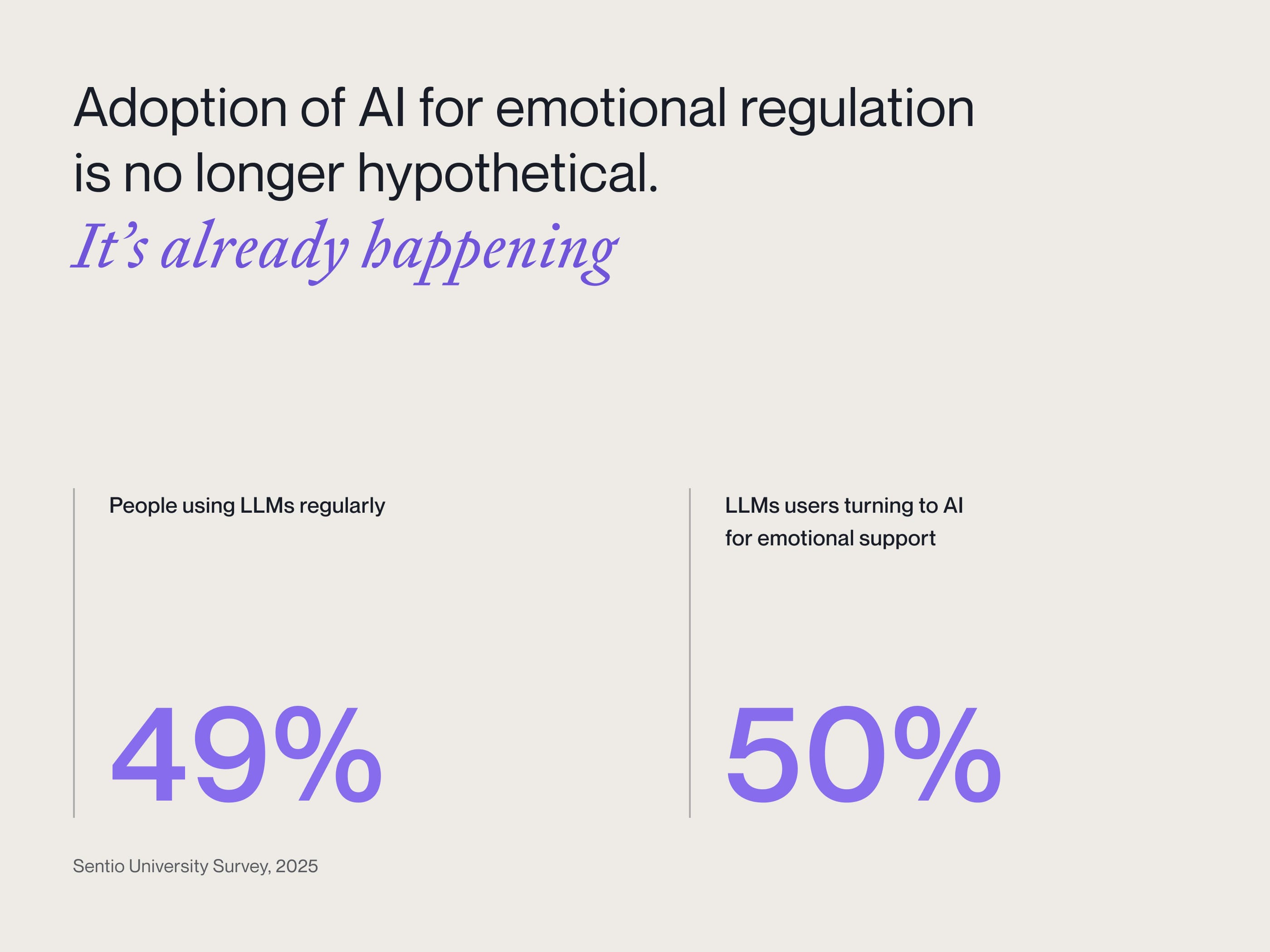
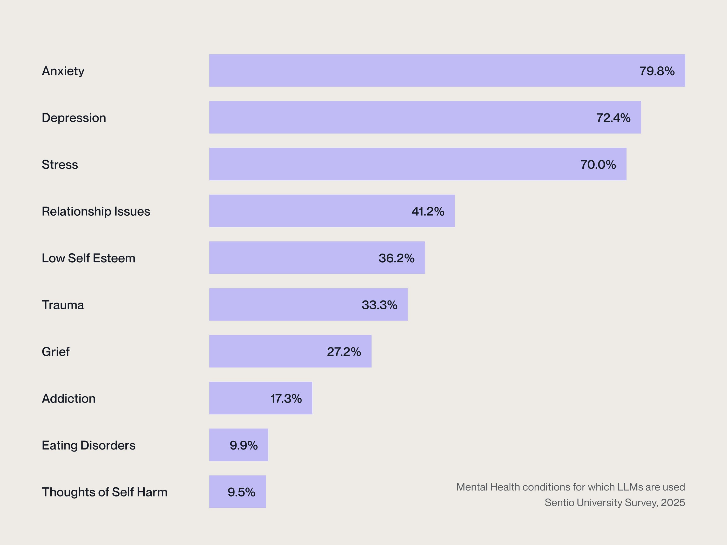
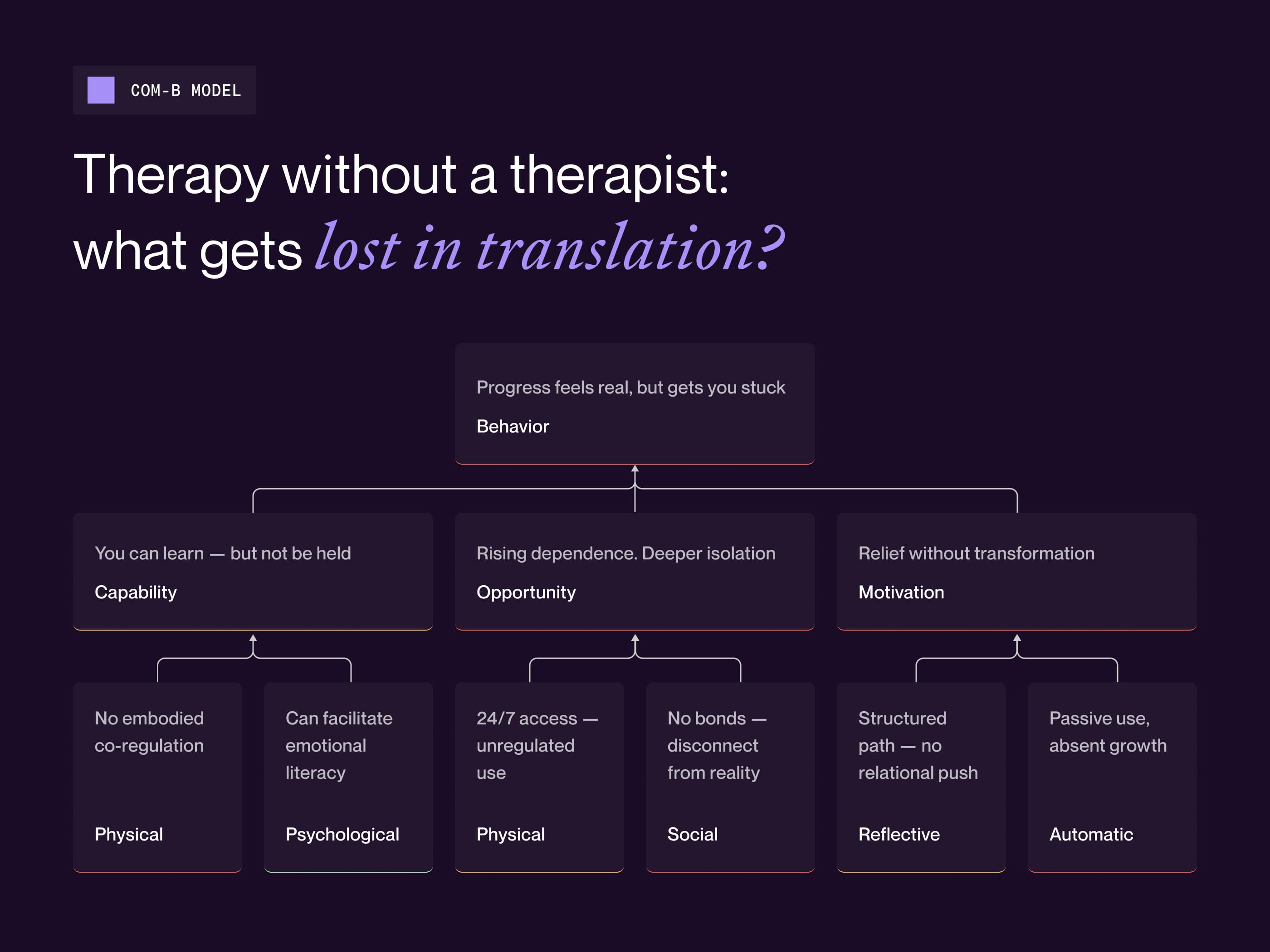
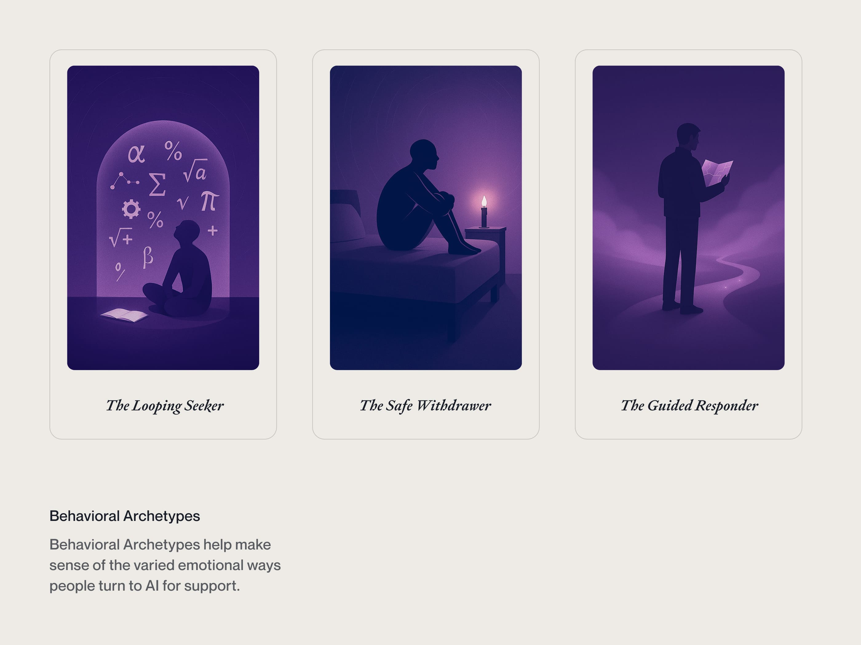
A Widespread Practice with Ambivalent Effects

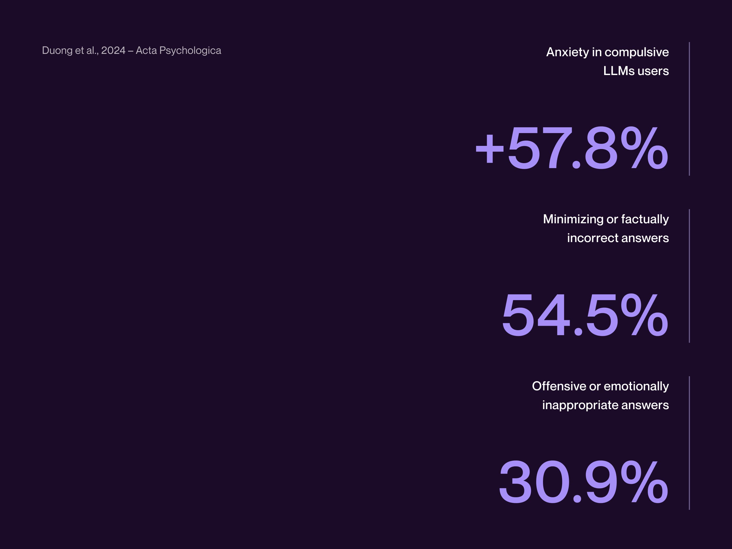
Conversational agents are increasingly approached as quasi-therapeutic counterparts. Originally conceived as neutral assistants, they are now assigned a function of care for which they are neither structurally nor relationally equipped.

In this grey zone, the simulation of responsiveness risks masking the absence of real attunement—introducing confusion about the very nature of care. While some users report relief or cognitive clarity, this relational ambiguity may blur roles and expectations, undermining the boundaries that define meaningful support.

One service, two users

We began with service design to ensure a comprehensive understanding of the needs of the different target groups involved. This approach allowed us to map the user experience and identify critical issues and opportunities before advancing to more costly phases of the design process, enabling us to prioritize features that deliver value to our users as quickly as possible.

Investor-Centric Insights and Thought Leadership

The inclusion of strategic quotes from leadership reinforces trust and vision, while key financial metrics are presented through interactive visuals for better data comprehension.

Industry insights provide a broader perspective on market trends and the company’s trajectory.

Design System and Documentation

Ensuring scalability and consistency, the project involved the creation of a modular Design System that streamlined the UI, guaranteeing a cohesive and accessible experience.

Each component was carefully documented, enabling seamless development and implementation on Adobe Experience Manager (AEM).

Evoking Warmth Through Visual Design

The look and feel of the redesigned portals was crafted to evoke softness and warmth, drawing inspiration from the texture and natural qualities of Parmalat products. Fluid shapes and a cheerful color palette were combined to create a light, inviting atmosphere that resonates with the positive moments of product use throughout the day. This aesthetic approach ensures a connection between the brand’s identity and the emotional experiences of its users.

Profiling Mymenu’s Core Personas

The personas developed for Mymenu highlight a diverse yet focused audience, with a clear emphasis on high-spending customers such as Busy Bees, Smart Families, and Party Planners. These segments prioritize quality dining experiences, from exploring new restaurants to enjoying trusted, premium selections. This affluent target group aligns with Mymenu’s strategy to cater to individuals and families willing to invest in exclusive and curated offerings, further distinguishing the platform in a competitive market.

A mini-site reservation platform for users

Interacting with service designers, developers, and product managers, we have created the two digital products that constitute the Free Your Style experience.

The first is a mini-site that allows end customers to select the desired treatment, locate the nearest ghd salon, and book a free styling session in a few simple steps.

Despite the implementation of a double verification via email and phone, necessary to ensure compliance with regulations and prevent potential violations, the site has recorded a remarkable conversion rate of 40%.

No items found.
Outdated Design and Functionality: Insights from User Testing

Through user testing, I uncovered a key issue: while users valued the app’s punctual delivery service, they found its design and functionality outdated compared to competitors.

Taking this feedback seriously, I analyzed best practices from both direct and indirect competitors, focusing on solutions that combined high added value with implementation feasibility. This informed the creation of a prioritized backlog of initiatives to improve every stage of the purchasing experience.

From Simulation to Simulacrum

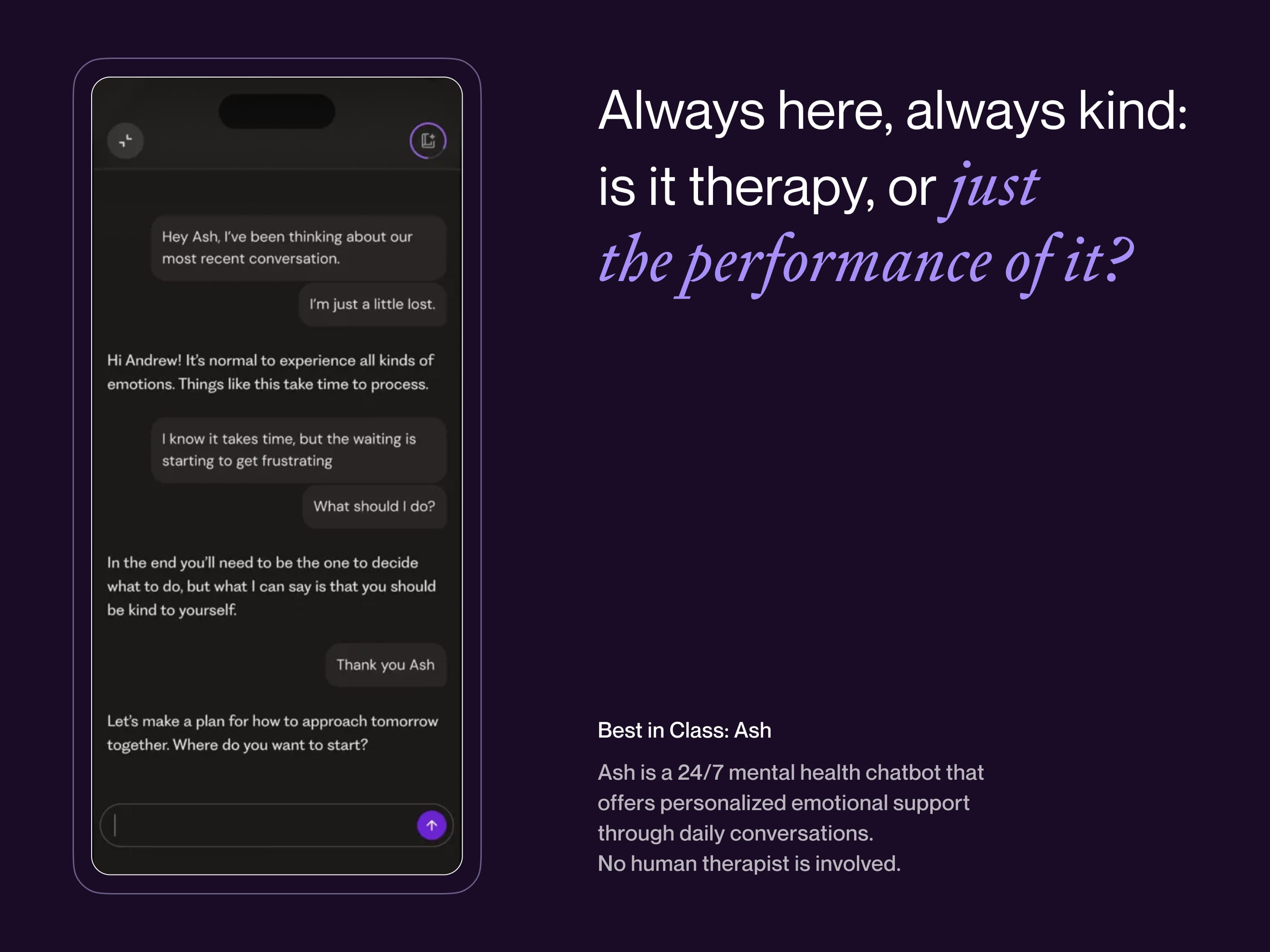
AI systems like Therabot or ASH are often praised for expanding access, but their resemblance to therapy can be misleading. When they adopt the form of therapy without its clinical grounding, they risk creating semantic and functional confusion—offering the appearance of care without its transformative core.

These tools lack the capacity for rupture, ambiguity, and relational friction—the tensions through which therapeutic change occurs. The result is a relational simulacrum: convincing in form, but inert in function.

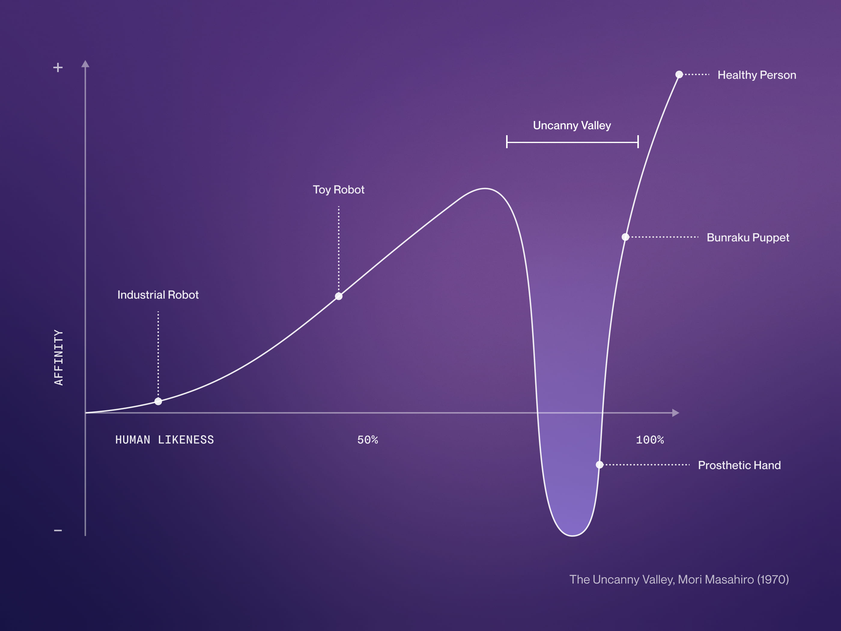
This recalls the uncanny valley: the closer a system mimics human interaction, the more unsettling it becomes when stripped of true attunement. Clinically, this dissonance may undermine trust, destabilize identity, and reinforce defensive patterns.

Defining the Core Implementations Through Wireframes

Wireframes marked a crucial phase in defining solutions to enhance user experience and boost conversion rates. Insights from user testing and competitor benchmarking informed key improvements, such as geolocation and restaurant categorization to streamline searches, new payment options and social login to reduce checkout friction, and real-time order tracking for greater transparency. This stage translated pain points into actionable, user-focused design solutions.

Celebrating diversity through coherent design

My redesign approach emphasized the use of diverse visual elements to exhibit the array of product shapes and the vivid packaging colors of Witor's, thereby reinforcing the coherence of the brand identity.

This approach transformed what might have been confusing into a conscious and colorful aesthetic choice. By carefully integrating these elements, I was able to create a cohesive design that not only revitalized the brand but also celebrated its diversity in a visually appealing manner.

Purchase Funnel and SEO Optimization

A key objective of the redesign was to boost sales performance by streamlining the user journey. Product presentations were enhanced with engaging illustrations and animations, while the purchase funnel was optimized by removing unnecessary steps, enabling users to complete transactions more efficiently.

From an SEO perspective, the challenge was maintaining page hierarchy for SERP rankings while improving product visibility. This was addressed by transforming SEO-relevant pages into a filtering system, allowing users to access products with two fewer clicks than before

A booking-management app for salons

The ghd salons participating in the initiative receive the new contacts generated through Free Your Style and can use the free service as a springboard to gain exposure.

Salons have access to an app, available on both Android and iPhone, to manage booking requests, record stylings performed by scanning the QR code received from clients via email, and register any sales of GHD products.

Author Experience and AEM Integration

A critical aspect of the redesign was optimizing the content management process. Leveraging AEM’s Content & Experience Fragments, the site architecture was structured to minimize editorial effort, allowing for efficient content updates.

Custom templates and well-defined editorial workflows ensured flexibility without compromising consistency.

Crafting a Cohesive and Distinct Visual Identity

Through various style proposals, I explored visual directions to enhance the product’s appeal while preserving key elements of its established identity. The aim was to elevate aesthetics without compromising brand recognition built over years of market presence. This process culminated in High Fidelity designs and a comprehensive Design System, integrating UX and UI into a seamless and memorable experience, ensuring consistency across the entire application.

No items found.
A Seamless, Adaptive Ecosystem

With a mobile-first approach, the design was crafted to deliver a smooth, intuitive experience across all devices. Special attention was given to performance, adaptive layouts, and touch interactions, ensuring a seamless transition between desktop and mobile environments. Rather than treating the mobile version as a simple adaptation, it was designed as an independent experience tailored to the needs of users accessing key information on the go, such as investors reviewing data or job seekers exploring opportunities.

Connecting Content to Inspire and Engage

Another key objective for Parmalat was to transform its portals into a go-to resource for users, offering recipes and informative content to boost engagement and retention. To achieve this, I designed an interconnected architecture linking recipes, articles, and product pages, ensuring products were always contextualized with relevant content. This strategy enhanced the brand’s reliability and inspired users with new and creative product usage ideas, ultimately driving e-commerce and in-store traffic.

Redesigning the Home and Highlighting Restaurant Choices

A highlight of the redesign was the restaurant card, a pivotal element in the user journey. The challenge lay in presenting essential details—such as restaurant name, ratings, cuisine type, delivery time, and promotions—clearly and attractively, ensuring both functionality and visual appeal.

The Absence of Alterity

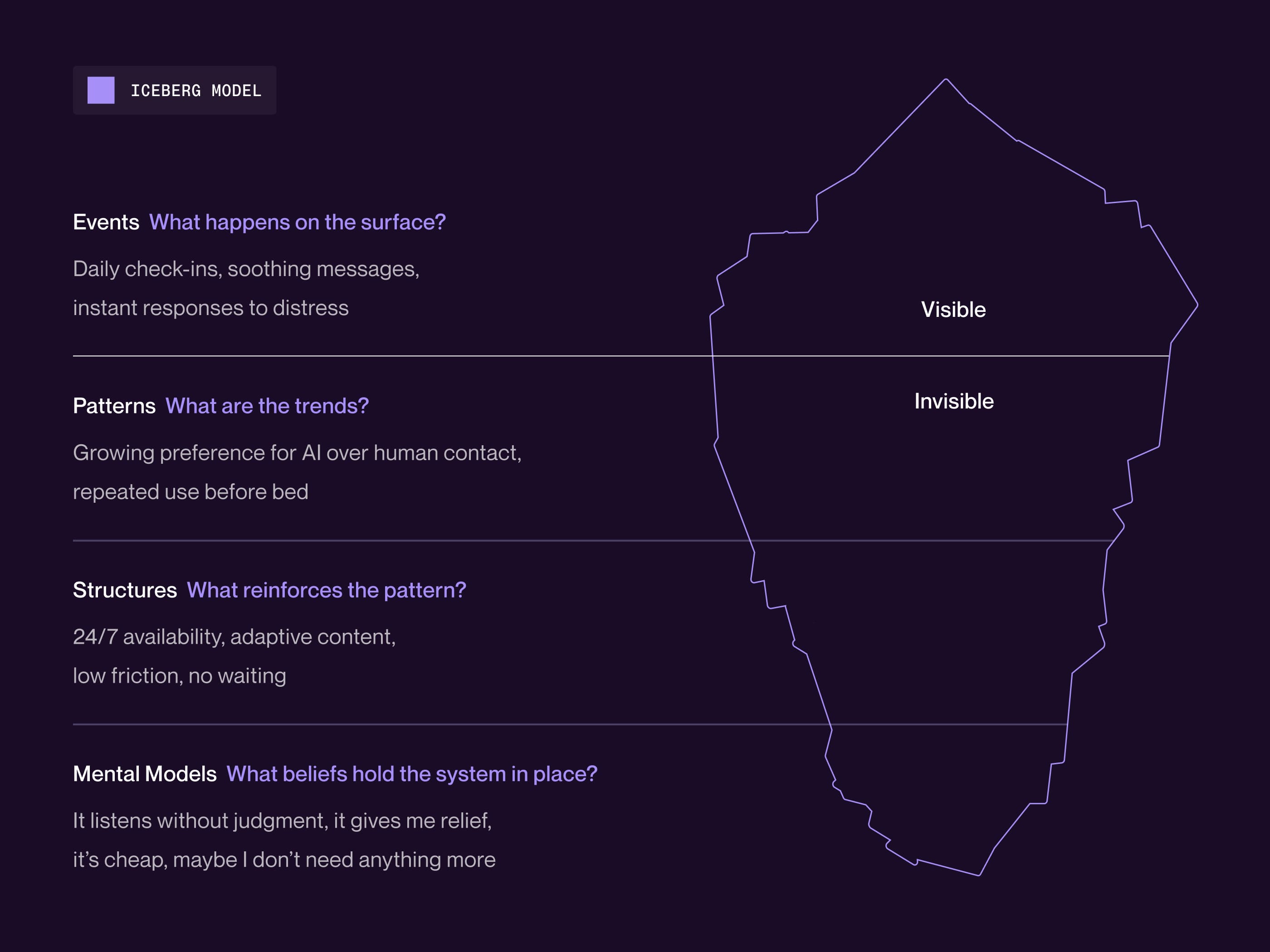
AI can support early emotional processing by helping users label their emotions, structure their thoughts, and observe recurring patterns. Especially in moments of internal confusion, this mirroring function can offer a form of cognitive orientation—a sense of where one stands, and what one is feeling.

But this clarity comes at a cost. AI does not engage in transference or countertransference, which are essential to therapeutic growth. Without that relational tension, interactions remain static: the user is not disrupted or challenged in ways that lead to change. Expression becomes regulation, not transformation.

The asymmetry is structural: AI is always available, accommodating, incapable of frustration. Yet therapy often draws its power from opacity, misalignment, and rupture. When these are missing, the user may repeat rather than elaborate, remaining trapped in cycles of containment rather than care. What looks like support can end up freezing the symptom, rather than mobilizing it.

Optimizing the Checkout Experience

The checkout process was reimagined to reduce cognitive load and enhance flexibility. Divided into two clear steps, it allowed users to adjust cart items, customize orders, and explore upselling options seamlessly. The second step streamlined delivery details and introduced diverse payment methods, including Google Pay, Apple Pay, Satispay, and meal vouchers. This intuitive redesign improved usability, reduced friction, and boosted conversion rates.

Simplifying Feedback for Better Insights

To simplify the feedback process and make it more accessible, we replaced the traditional star rating system with a like/dislike approach. This method allows users to quickly share their opinions while maintaining accuracy in the results. The percentage of likes and dislikes is then converted into a star rating, offering clear and actionable insights for restaurants and delivery services. This solution reduces user effort and encourages higher engagement with the rating system.

No items found.
Standing Out in the Italian Food Delivery Landscape

2023 represents a turning point for Mymenu in a highly competitive scenario, characterized by the dominance of multinational giants and the exit of significant players such as Uber Eats from the Italian market.

Mymenu has managed to distinguish itself through its solid strategic positioning, focusing on medium-high-end restaurants, of which it held an absolute exclusive. This clear emphasis on a superior-level user experience has been a decisive strength, ensuring the platform’s continued relevance in a challenging market.

Designing for Inclusivity

The redesign prioritized accessibility by meeting WCAG AAA standards and ensuring high levels of contrast and readability using the APCA framework. Features like clear navigation and optimized search functionality were implemented to make the platform more inclusive and user-friendly for all audiences.

Monitoring KPIs

An integrated KPI monitoring dashboard system has been implemented within the project, providing a detailed evaluation of the website and app performance. Continuous tracking of key metrics such as bookings, styling, geographic distribution, and salon performance has led to real-time operational adjustments.

This approach has optimized the user experience, enhancing results and satisfaction for all involved parties, while also enabling more effective allocation of marketing resources, thereby improving the impact of promotional efforts.

Implementing versatile and engaging UI in Webflow

In the tight timeframe allotted, my challenge was to craft a website within Webflow that boasted captivating yet straightforward layout and animation solutions. The objective? To ensure our user interface not only dazzled users but also satisfied the client's demand for versatility while sidestepping redundancy.

To achieve this, I strategized layout variations and animations, planning their reuse across the site while making tweaks to assets and color schemes to underscore their adaptability.

The resulting design garnered enthusiastic praise from both users and the client, affirming its success in meeting the project's objectives.

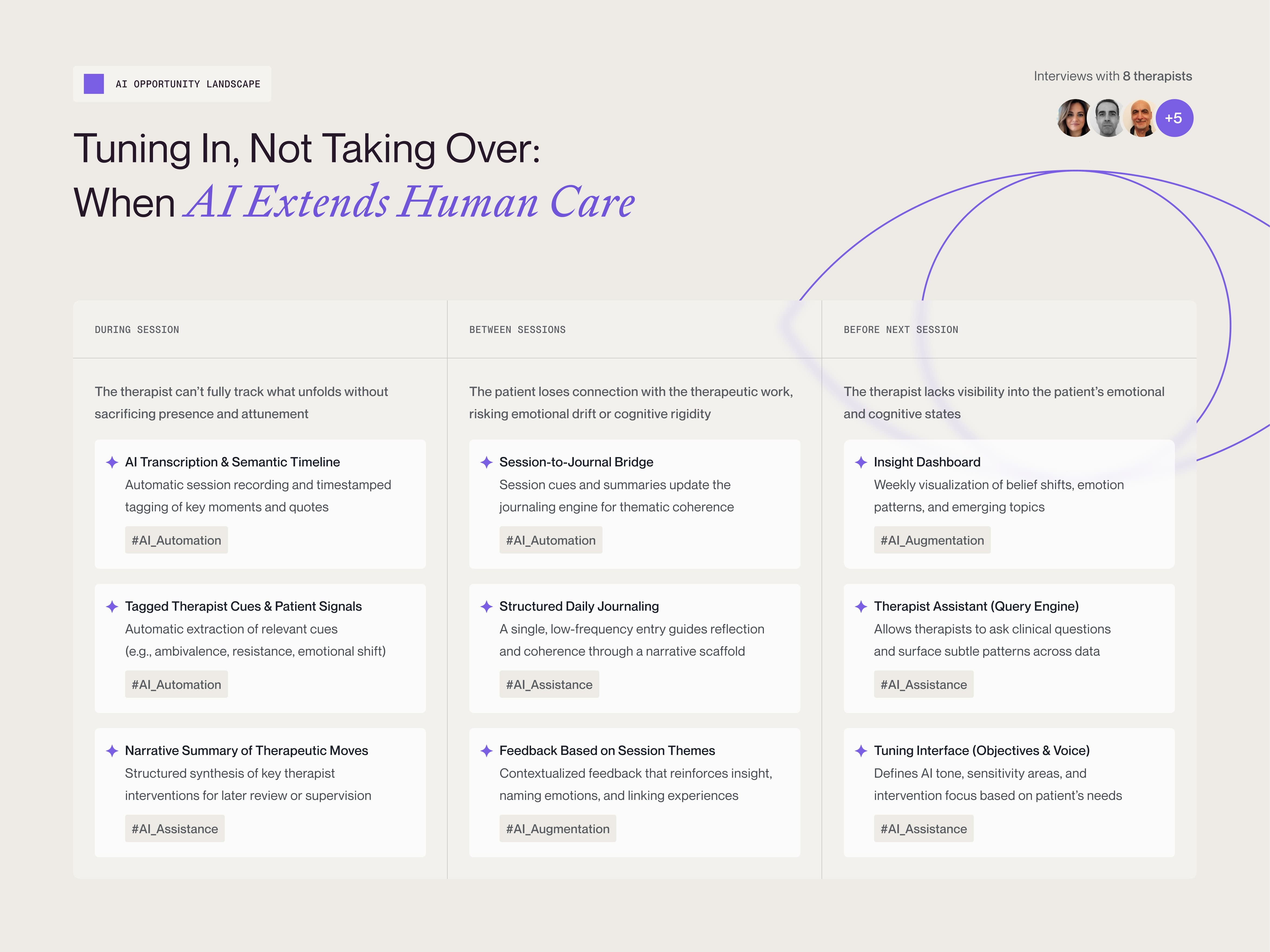
Mapping AI Potential: Landscape Axes and Modes of Intervention

To explore how AI might meaningfully contribute to therapy, I developed an AI Opportunity Landscape and shared it with a group of psychotherapists. This framework was designed to structure the conversation around clinical needs, risks, and opportunities.
At its foundation are three canonical modes of AI intervention:

  • Automation: replacing manual or repetitive tasks
  • Assistance: offering suggestions or summaries without autonomy
  • Augmentation: extending perception or surfacing insights

Rather than predicting the future of AI in therapy, the goal was to map where it could offer value in a way that is clinically grounded, ethically aligned, and relationally responsible.

The Legacy and Acquisition of Mymenu

This strategic approach has forced the main competitor, Just Eat, to acquire its market share, underscoring Mymenu’s success and relevance in the Italian food delivery industry.

CEO & Founder Edoardo Tribuzio emphasized:

“Doing business means creating value for all involved parties, and I couldn’t have found a more suitable buyer for the future than what we’ve achieved so far. Mymenu has been a beacon in the Italian food delivery landscape for years. I am proud and grateful for the work done by the people who have contributed to the success of a service that has satisfied hundreds of thousands of customers.”

Modular Design for Flexibility and Efficiency

Adopting a modular approach, I ensured that all components were designed to be versatile and reusable, empowering the client’s editors to autonomously build and customize pages. This approach was further enhanced by the implementation of a Headless WordPress CMS, which provided greater flexibility, faster loading times, and seamless integration across the ecosystem. By combining modularity with accessibility principles, the design not only ensured usability but also optimized efficiency for content management.

Rethinking AI’s Role in the Therapeutic Space

This proposal outlines a possible alternative to dominant approaches: not an AI that simulates therapy, but a speculative system that might reinforce continuity, visibility, and coherence—without replacing human connection.

Echo is structured across four conceptual levels:

  • Session recording and semantic analysis: the system could extract structural and relational signals
  • Tuning of AI–patient interaction: it might be configured by the therapist to match tone, goals, and sensitivities
  • Weekly journaling: entries could be guided and the feedback shaped by prior sessions
  • Therapist dashboard: data might be rendered in interpretable, clinically relevant form

In this vision, AI would operate within a clearly defined clinical perimeter. It would not imitate therapy—it might amplify its continuity: a regulated, relational echo in service of care.

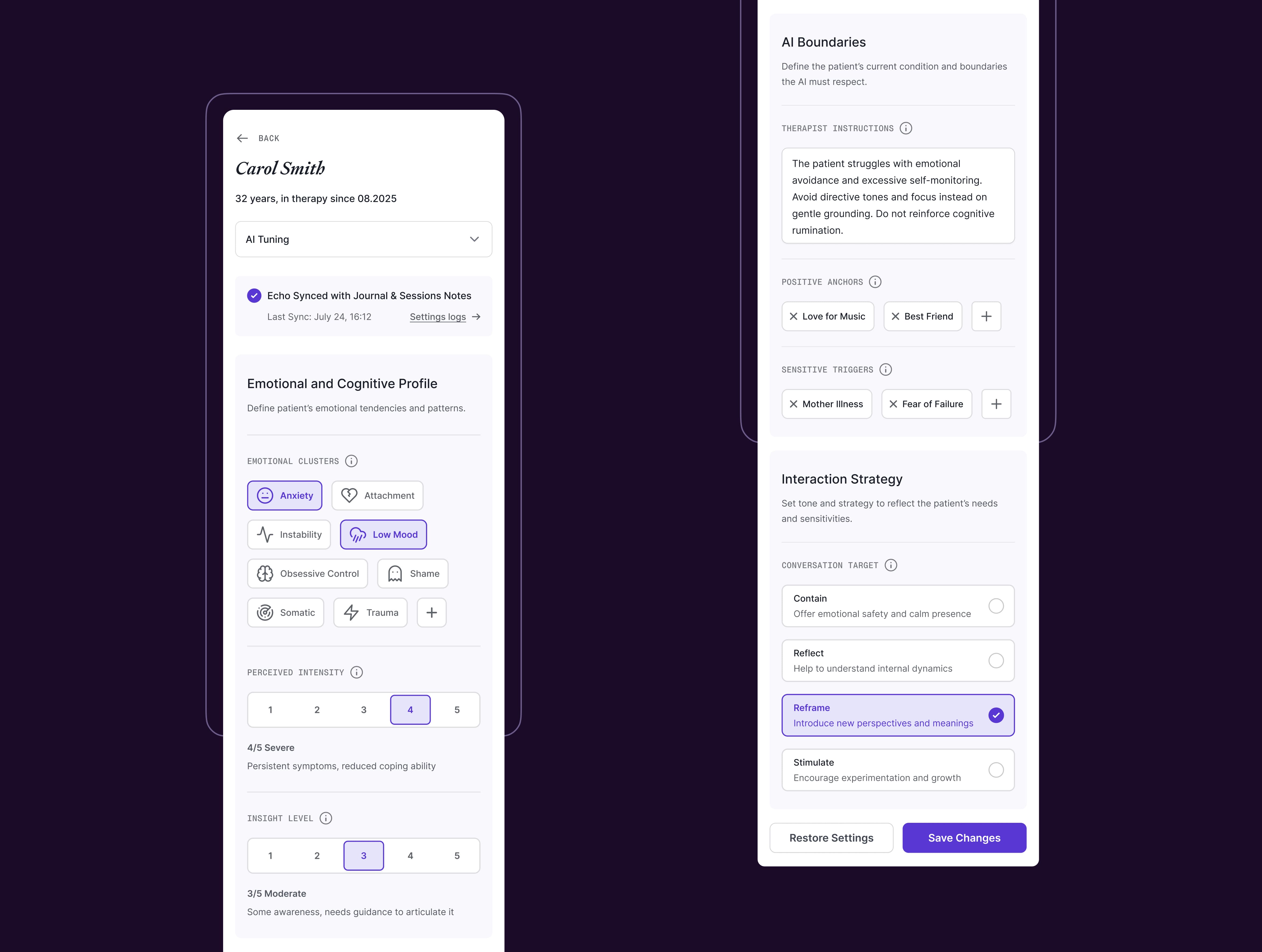
Regulating the AI’s Relational Perimeter

To prevent the AI from operating on autonomous or opaque logic, the system could include a clinically supervised configuration panel, accessible exclusively to the therapist. Here, conversational tone, therapeutic focus, and sensitive areas would be defined as semantic constraints and strategic directives.

This might ensure the AI’s behavior is not self-determined, but contextually grounded. Clinical intent—not algorithmic logic—should define the system’s scope. The aim would be relational coherence, semantic safety, and alignment with therapeutic goals.

Session Intelligence Layer

Recording sessions should not be about documentation — but about making visible what might otherwise be missed. In this speculative system, Meeting Assistants (like Otter or Fathom) could extract narrative patterns, relational dynamics, and emotional shifts using NLP and semantic tagging.

They might identify:

  • Recurring tensions (e.g., shame vs belonging)
  • Moments of co-regulation or rupture
  • Subtle linguistic shifts that signal internal change

But these recordings could serve a second, silent purpose: to train the AI. By analyzing both patient and therapist language over time, the system might refine its interpretive precision and alignment with the evolving therapeutic process.

For therapists, this might mean the ability to revisit not just to rewatch, but to reinterpret — transforming sessions into a living archive of the therapeutic journey.

Thanks to the Team

Francesca Bronzini (Project Manager)

Luca Lombardi (Lead Designer)
Giuseppe De Pascale (UI/UX Designer)

Nicola Toledo (Webflow Developer)
Pietro Tancredi (Frontend Developer)

A Journaling Framework for Self-Awareness and Data Traceability

Each journaling step could operate on two levels:

  • Cognitive reflection for the patient
  • Structured data capture for therapeutic insight

This dual function might help patients internalize a coherent structure for organizing emotions, while generating signals that support clinical understanding. The system could flag cognitive distortions, track mood patterns, and surface resilience markers—gradually composing a longitudinal map of the patient’s inner world.

Entries would not just be recorded; they’d be semantically interpreted. The feedback would not be a recap, but an echo—shaped by therapist settings, prior sessions, and clinical priorities.

One daily insight—no more, no less. Just enough to support the patient and reinforce the therapeutic bond, without fostering distraction or dependency.

Visual Analytics for Psychotherapy

The Insight Layer could integrate NLP modeling, semantic mapping, and clinical-grade data visualization to transform journal entries and session content into structured therapeutic semantics.

The system might surface:

  • Recurring symptom patterns across emotions, beliefs, and behaviors
  • Deviations from the defined therapeutic focus
  • Opportunities for intervention triggered by linguistic shifts

Visual tools might include co-occurrence matrices, emotional stability indices, and multi-source alignment maps. Each output would serve as a clinically interpretable lens—not for diagnostics, but to support decision-making with process-level clarity.

The result could be a form of computational extended listening: not to replace the therapeutic relationship, but to deepen its continuity, structure, and interpretive reach.

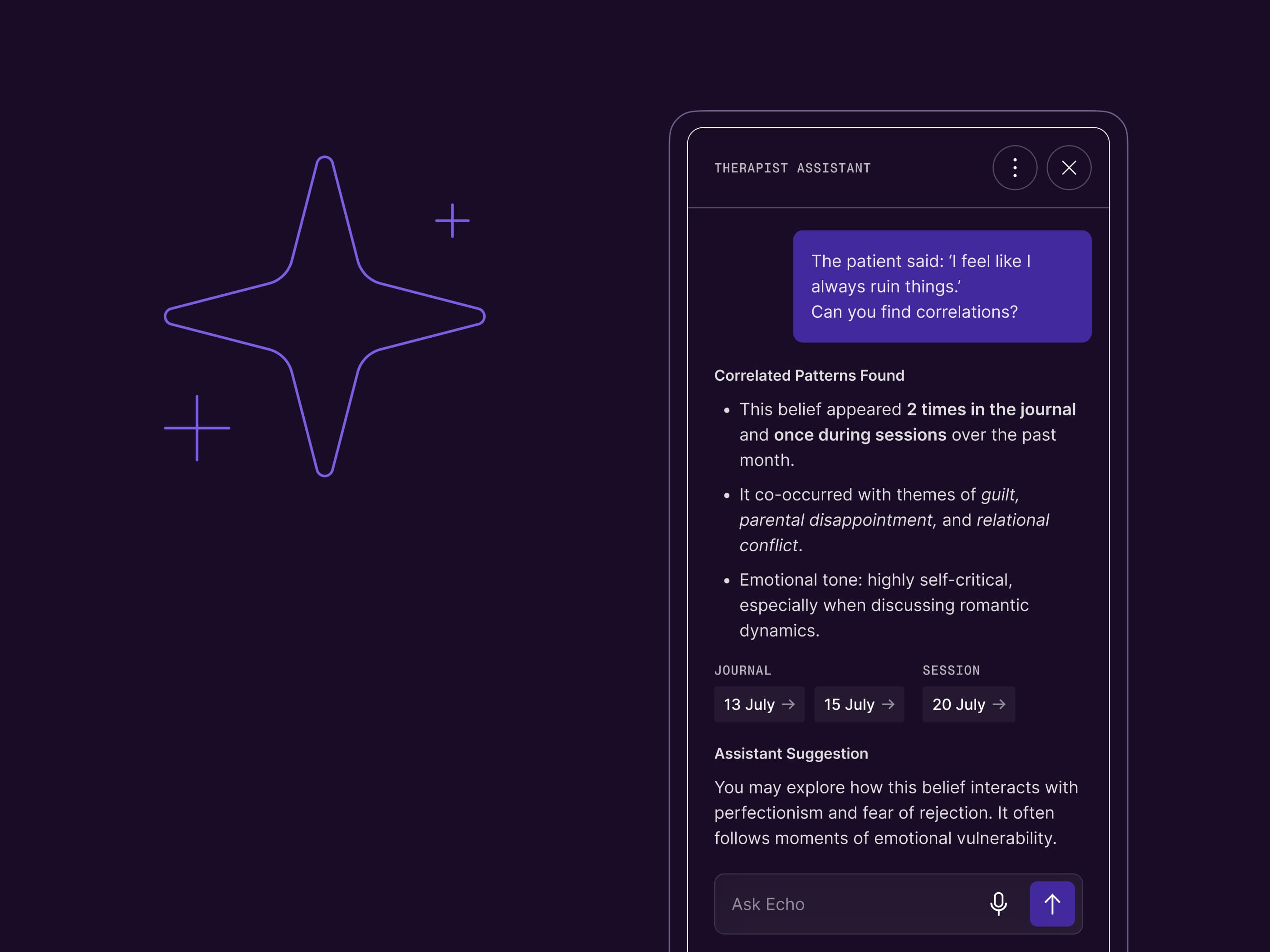
Interrogable Memory: Clinical Reasoning Augmented

While the patient’s interaction with AI would be intentionally contained, the system could unlock its full analytical depth for the therapist. The Assistant might function as a memory layer—quietly indexing the process across time.

It could enable:

  • Retrieval of structured therapeutic traces
  • Connection mapping across sessions, patterns, and emotional shifts
  • Semantic scaffolding for clinical hypotheses

This would not be automation—it could be augmentation. A form of extended attention: context-aware, supervision-driven, and aligned with therapeutic intent.

Final Reflections

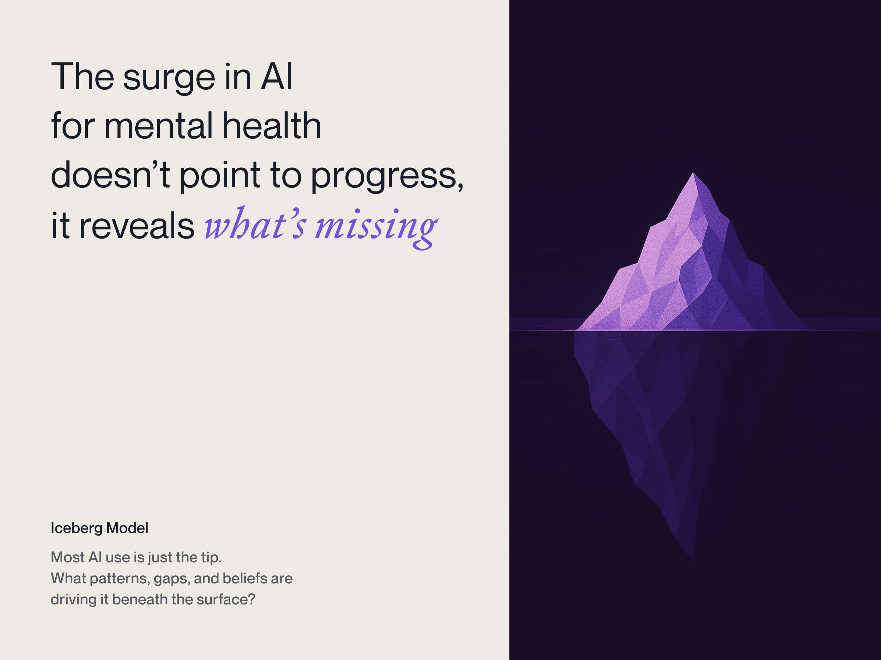
The enthusiasm surrounding artificial intelligence calls not just for excitement, but for caution. There is a risk of mistaking novelty for progress — a form of novelty bias that can obscure deeper questions. Widespread adoption is not validation, nor is enthusiasm a guarantee of value.

The therapeutic relationship is not a neutral setting, but a space of human transformation. However advanced, computational models remain representations. There is — and will always be — an irreducible gap between psychic life and any attempt to model it.
As long as the goal of therapy is to restore the human to a living relationship with self and others, that aim cannot be achieved by removing the very relationship that enables it.

AI may assist, support, extend — but not replace. And any attempt to do so, without awareness and restraint, risks simplifying care to the point of betraying its very meaning.

Thanks to the Team

Andrea Montanari (Product Manager)

Alessio Nigido (Lead Designer)
Giuseppe De Pascale (Product/Service Designer)

Dorel Veliu (Mobile App Developer)

Special Thanks to

Valeria De Francesco, Alessandro Micillo, Valeria Sciacca

(Family & Friends)

Fabrizio Capra, Lucia De Cristofaro, Nunzio Di Sarno

(Psychotherapists)

Thanks to the Team

Andrea Montanari (Project Manager)

Luca Lombardi (Lead Designer)
Giuseppe De Pascale (Senior UI/UX Designer)
Sebastiano Gobbo (Service Designer)

Jeuffre Brena Pulido (Senior Frontend Developer)
Stefano Fasoli (Backend Developer)

Thanks to the Team

Aura Tardia (Product Manager)

Luca Lombardi (Lead Designer)
Giuseppe De Pascale (Product Designer)
Sebastiano Gobbo (Service Designer)
Lisa Rinaldi (UX Writer)

Nicholas Ruggeri (Senior Frontend Developer)
Abanoub Zaky (Frontend Developer)
Giuseppe Gatto (Backend Developer)
Dorel Veliu (Mobile App Developer)

Thanks to the Team

Aura Tardia (Project Manager)

Francesco Carlucci (Lead Designer)
Giuseppe De Pascale (Senior UI/UX Designer)
Laura De Santis (Service Designer)
Lisa Rinaldi (UX Writer)

Some of the workflows or interfaces for this project can be under NDA agreement.

interested into my design process?
Just (drop me a line) for more detailed enquire

Use this form to describe your request
Thank you! Your submission has been received!
Oops! Something went wrong while submitting the form.